Witchery Website Refresh
Witchery, a leading Australian fashion brand, needed to enhance their online shopping experience to boost customer retention and conversions on mobile.
Year
2022
Role
UX Designer
Responsibillites
Research and Design

Background
Following the Covid pandemic, Witchery who had traditionally relied on both e-commerce and their physical stores, sought to place greater emphasis on their online presence. The website had begun to feel outdated and was no longer meeting user needs. Unlike a physical storefront, it lacked the impact and ease customers expected. My role was to optimise the site, improve conversions, and future-proof the digital experience.


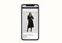
Original website's product and category pages
Case Study
Improving upon the size guide
The mobile size guide was cut off and not responsive. This led to lower click-throughs, fewer cart additions, and poor retention. Users couldn’t view essential sizing information, which discouraged purchases

Test 1
Simple and Function
-
Made the size guide fully responsive across mobile.
-
Included inches, centimetres, and international sizing.
-
Added a short returns policy summary for quick reassurance.


Test 2
More Details
-
Created a “how to measure” guide in Adobe Illustrator to show key body measurement points.
-
Replaced the long returns policy with a button linking to the full page.
-
Expanded the size guide with add-to-cart and stock status options.
-
Kept details in an expandable section to reduce scroll depth while offering reassurance.


Results and Decision
Both tests lifted add-to-cart rates. However, Test 1 emerged as the best choice as it kept scroll depth minimal while delivering clarity, aligning seamlessly with Witchery’s brand and mobile UX goals. Consequently, this version went live and later informed updates on desktop and tablet layouts

New size guide on desktop